

Project summary:
One of our primary objectives for weekday.com is to enhance the customer journey, making the process from product selection to purchase as seamless as possible. Redesigning the mobile navigation for weekday.com, with a focus on a mobile-first approach.
The challenges:
-
Branding and Spacing Inconsistency
-
Lack of Smooth Navigation
-
Insufficient Encouragement to Continue Shopping
-
Lengthy Sizes List without Categorization
Brand consistency
Smooth Navigation
Continue shopping
Categorization
The solution
Create a design system that includes reusable components and layout grids, enabling designers to maintain consistent spacing throughout the application.
Utilize clear and intuitive navigation elements such as drop-down menus, breadcrumbs, and contextual links to help users easily navigate through the website. Display related products or items frequently bought together on product pages to encourage users to explore additional options. Categorize the sizes list based on relevant criteria such as clothing type, gender, or age group to simplify the selection process.
Design process
-
Conduct users interviews
-
Competitor analysis
-
Define the scroll reach and click through rate analysis on the current navigation
-
User flows
-
Style guide for the brand consistency
-
Wireframe and rapid prototyping on the medium fidelity mock-up which is based on the data and research. I focused on the changes that need to be made.


A quick sketch for ideas
Create a rapid sketch that incorporates research findings from a UX design perspective to generate and explore new ideas.


Create a mockup that prioritizes optimization for the areas requiring improvement
-
Identify areas for improvement: Review user feedback, analytics data, and research findings to identify specific areas that need optimization or have received negative feedback.
-
Focus on key areas: Prioritize the identified areas for improvement and concentrate your design efforts on addressing those issues first. This might include enhancing navigation, improving content layout, or refining specific interactions.
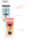

With a primary focus on the detail view, prioritize the optimization of spacing and the strategic grouping of essential information.


Finalise
Create a medium-fidelity prototype to demonstrate the design concepts and interactions with sufficient detail for effective testing and evaluation.

Here show a clickable prototype in Figma (can open to a full size screen for testig)